Modernizing a Live, Mission-Critical B2B Platform
Modernizing a live, mission-critical B2B platform — establishing scalable patterns, then using research to solve the system's biggest usability problems.
00

problem
Modernize a 20+ year-old pipeline ops platform and show business value, without disrupting the legacy backend that 2.0 had to share until legacy could be sunset.
solution
I established a strong foundation and reusable patterns, then let user research and user impact direct the work to where it mattered most.
Building a Framework the Platform Could Grow Into
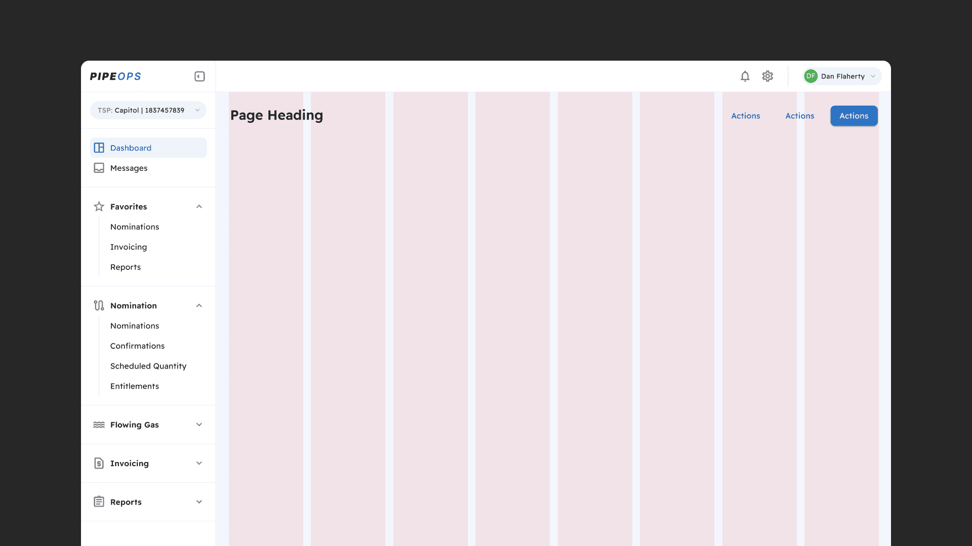
Before we could improve any single screen, the platform needed a strong foundation. I designed an app framework along with patterns the team could reuse instead of solving the same problems over and over. Notable among these were a flexible data grid, a stepped form for complex multi-part tasks, and an advanced lookup for finding data-dense records. Once created, they became the shared vocabulary for the rest of the platform.
Making a Splash: Prioritizing Customization for Users
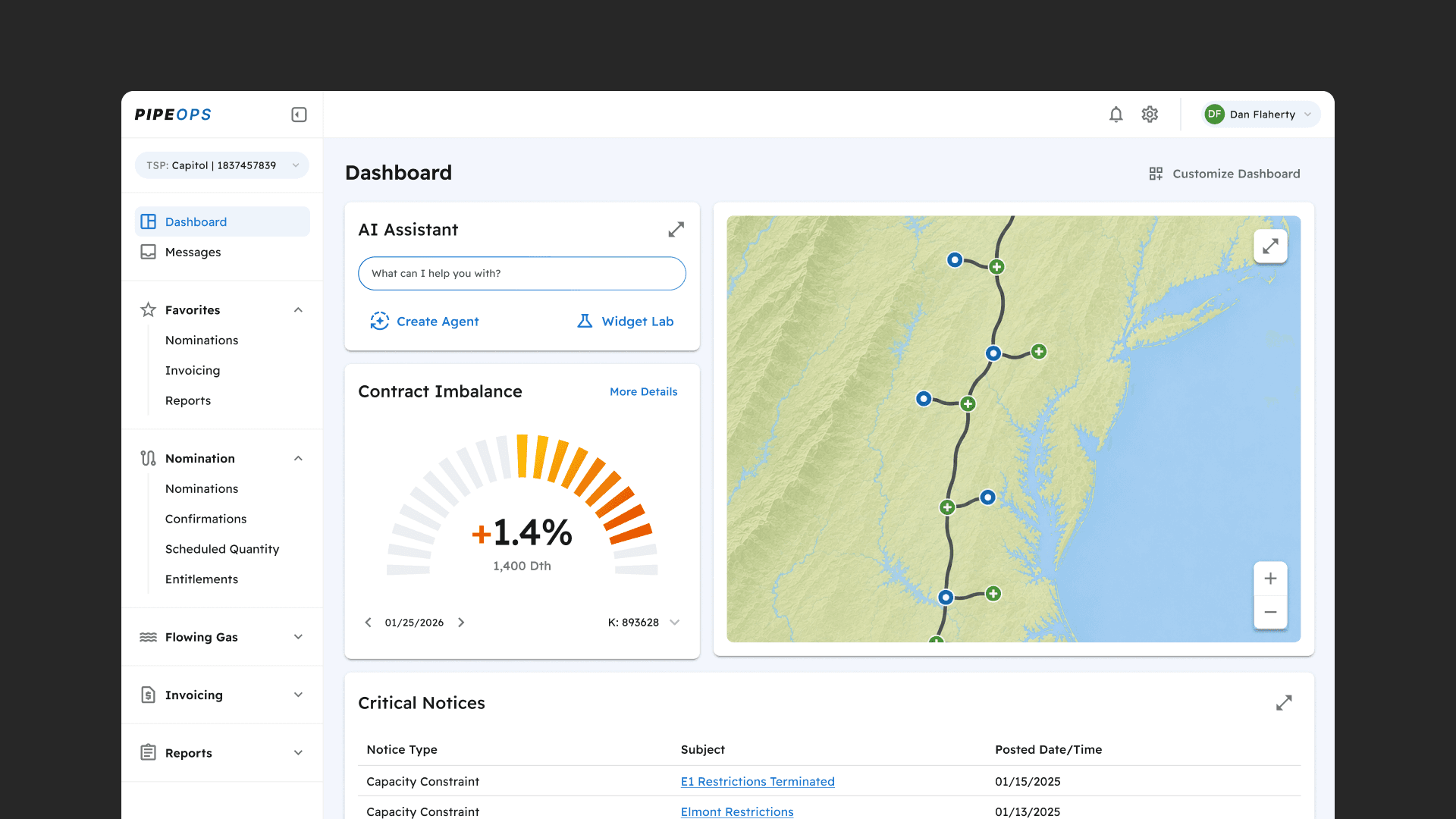
After establishing the app's framework, we turned to the landing page dashboard. The challenge was giving a broad set of users, each with different goals, a workspace they could tailor to their own needs. A growing widget library addressed this, with plans to keep extending the catalog. On the horizon: an AI assistant and widget lab for even deeper customization.
Testing for Systemic Issues
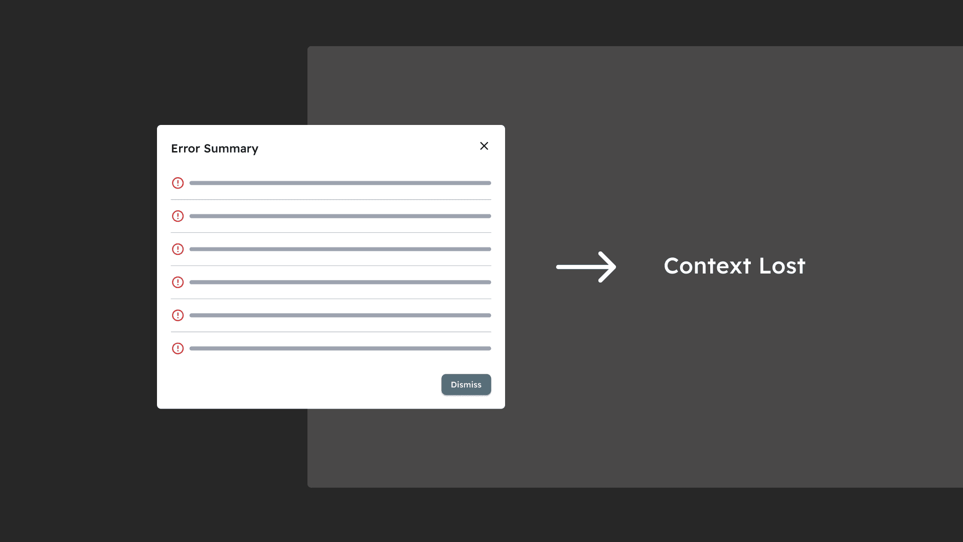
We ran broad usability testing across the legacy platform's most impactful features to find pain points worth solving holistically. The largest issues were workflows with no clear happy path and obtrusive system feedback. Confusing workflows often triggered large batches of errors, all dropped into a single summary dialog. Once dismissed, users struggled to remember what they were supposed to fix.
Error Handling with a Light Client
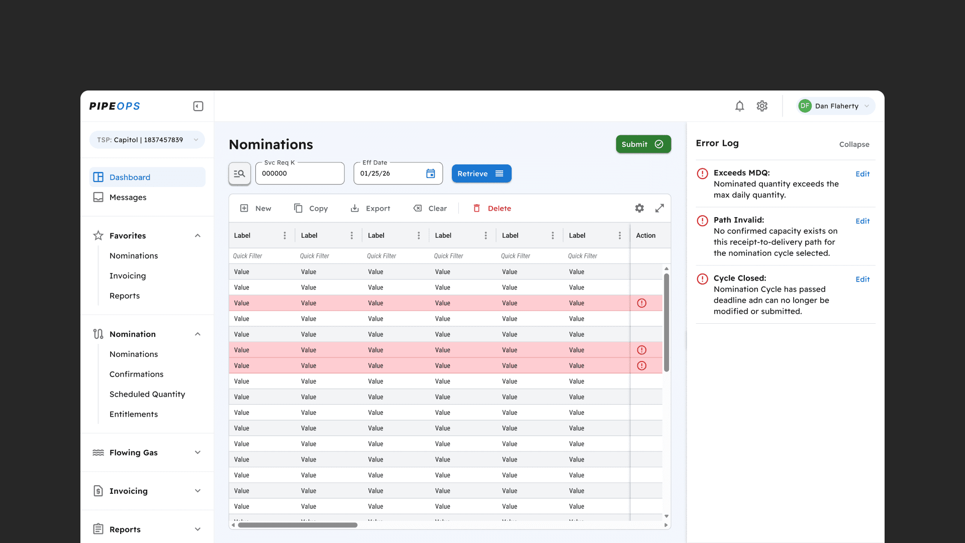
We wanted to keep the client as light as possible, so error handling couldn't rely on front-end validation. That work had to live in the backend. I designed an error log that surfaces batches of errors clearly without forcing users to resolve everything at once. They can see what needs attention, understand it in plain language, and jump straight to the erroneous field with a click.
Users spent 4x less time searching for errors compared to the legacy dialog, and error log usage led to 100% resolution with no re-errors.
Oh my god, this is so nice, and it saves me so much time! I love that I can just click the edit button on each error without having to search for the right cell. — A Satisfied User
Challenges and Constraints
The natural gas industry is heavily regulated by FERC and NAESB, each with its own constraints, on a platform that was also mission-critical and couldn't go down. That combination meant enhancements carried real risk if prioritized poorly. On top of that, our team was lean, with limited resources and no room to build tooling or a design system from scratch. Together, these constraints led to the decision to run 2.0 and legacy on the same backend concurrently until legacy could be sunset and those resources redirected to rebuilding the backend from the ground up.
How We Addressed Them
The regulatory complexity and mission-critical stakes meant every enhancement carried real risk if prioritized poorly, so we built a framework for the team to discover, log, investigate, and prioritize work with a clear line of sight. This kept decisions concrete and weighed against bandwidth, timeline, and user impact, rather than reactive to whichever request came in loudest. (more on this in the strategy case study)
With a lean team and no room to rebuild from scratch, we chose to build on the MUI component library instead of a custom design system. This gave us a shared foundation and vocabulary from day one, so the team could spend its limited time augmenting components to meet business needs rather than building and maintaining a library of our own.
see also