First Tee | PGA
Transforming a youth development program into a more structured and engaging experience for coaches, participants, and administrators
00
problem
First Tee wanted to gamify the program in a way that increased engagement, streamlined coach workflows, and gave administrators better visibility into attendance and participant progression. Because the organization operates across very different local contexts, they also needed a more structured system that could help create a more consistent experience across chapters. Much of that information was still being tracked manually, which made it harder for coaches to move quickly in class and limited what admins could see in Salesforce. The challenge was to support real-time data capture, participant motivation, and program visibility without adding more friction for coaches.
solution
We approached the work as a service design problem, not just an app update. By grounding the solution in stakeholder input, coach workflows, and usability testing, we created a more structured system for attendance, badging, progression, and reporting that fit naturally into the coaching experience. The result was a more engaging program for participants, a more streamlined set of tools for coaches, and better insight for administrators into attendance, progression, and coaching consistency — all while laying the groundwork for more advanced gamification in the future.
Defining the problem as a service, not just an interface
We were brought in to gamify the First Tee program, but the challenge was bigger than adding a few new app features. The organization wanted to increase participant engagement, streamline coach workflows, and give administrators better visibility into attendance and progression through Salesforce reporting.
Because First Tee operates across very different local contexts, from climate to socioeconomic conditions, consistency was also a major concern. By creating more structure for coaches and their programs, the organization hoped to close some of those gaps and build a more unified experience across chapters.
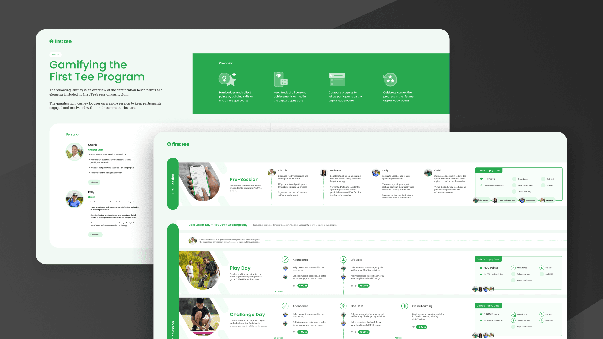
Using architecture and testing to shape the product
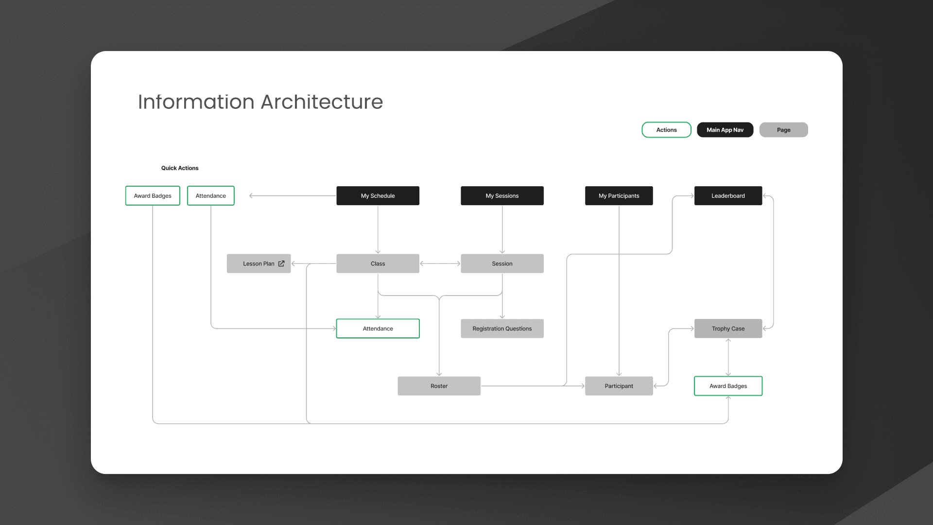
Once we understood the coach workflows, we mapped the application’s information architecture to show where the new features fit into the existing product. That helped level-set the team, align stakeholders, and create more productive conversations with Salesforce engineers around feasibility and implementation.
Grounding the work in real coach behavior
After aligning with stakeholders, we worked directly with coaches to understand how the program functioned in practice. Coaches were our primary users, and their needs were immediate and practical: they had to manage groups of energetic kids, take attendance quickly, keep sessions moving, and recognize participant progress without adding more administrative burden.
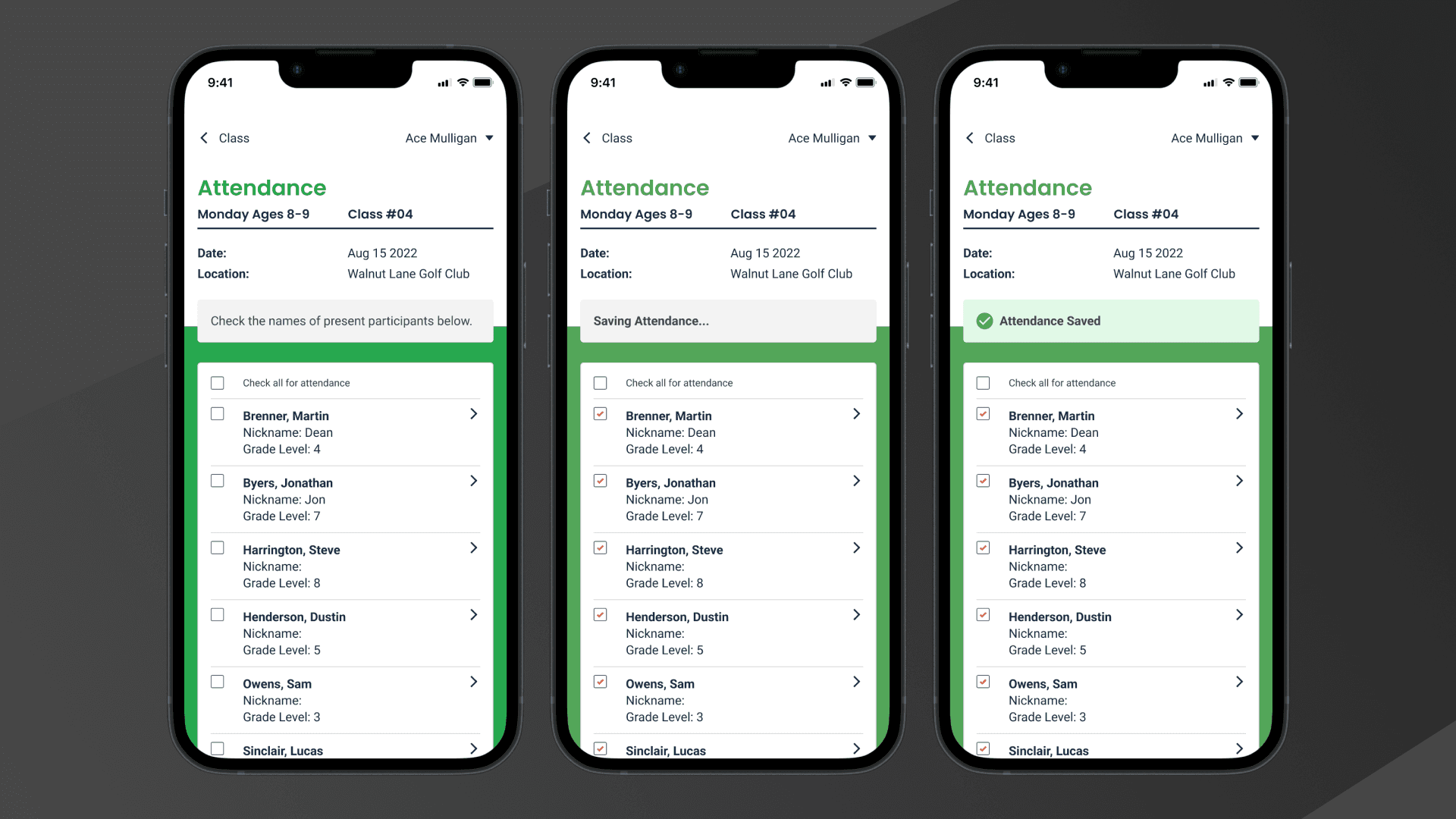
Attendance was one of the clearest pain points. Coaches were using scratch pads, notes apps, and other manual methods, then passing that information along to admins for Salesforce entry. The goal was to bring that data collection directly into the coach workflow so attendance could be captured in real time and made useful to the broader organization.
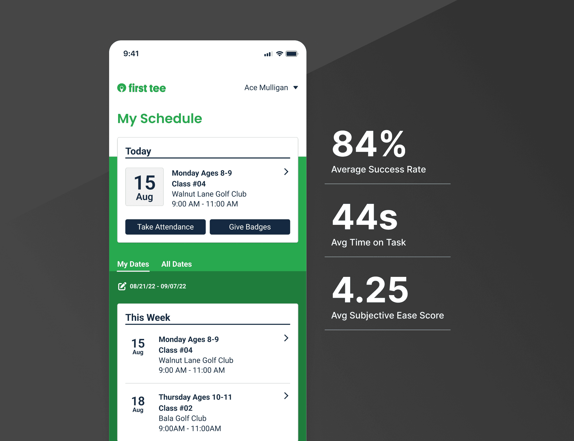
Creating repeatable workflows around the moments that mattered most
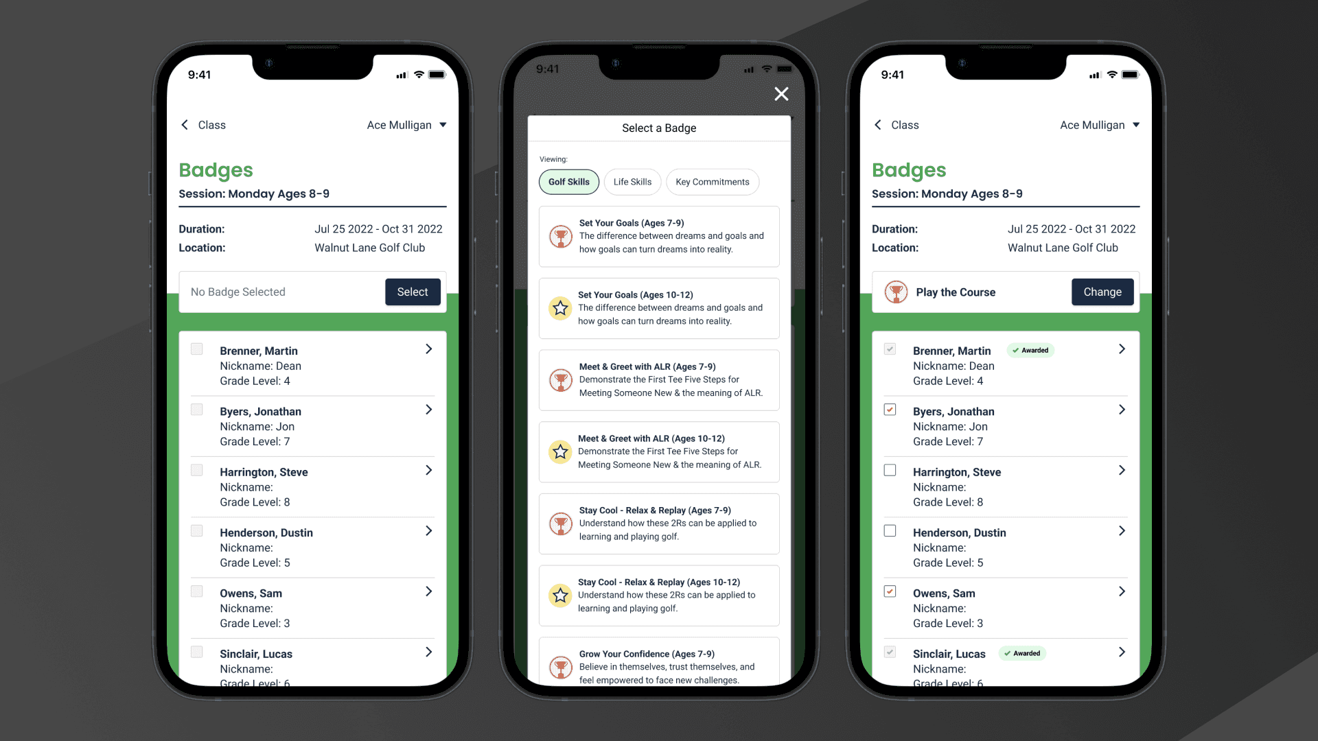
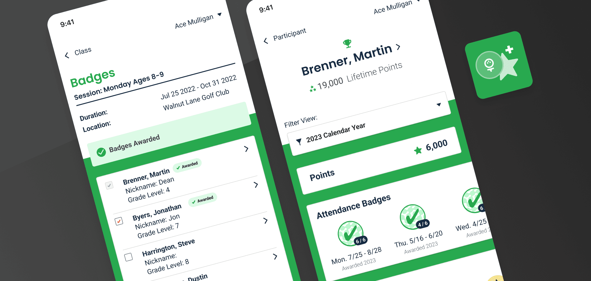
Two needs consistently rose to the top: taking attendance and awarding badges. Those were the moments coaches needed fastest access to during class, so we designed the application around them. The goal was to let coaches move directly into those workflows from their current class view, complete the task quickly, and send the information straight into Salesforce without extra manual steps.
We aligned the attendance and badging flows closely so they used similar patterns and did not require relearning. That consistency mattered because coaches were often working quickly in live class settings and did not have time to navigate more complicated interfaces.
Making progress visible and more meaningful
Badges did more than gamify the experience. They gave kids something concrete to work toward, encouraged more useful conversations with coaches about skill progression, and helped recognize success in a way that motivated participants differently. Badges also made progression easier to understand and discuss over time.
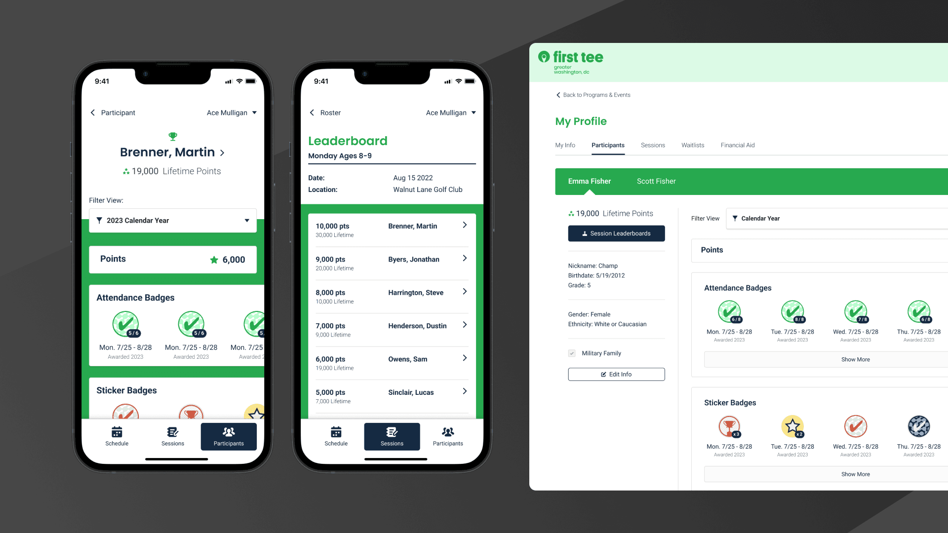
That same visibility extended to coaches, parents, and administrators. The trophy case gave coaches a way to review progress without checking physical bag tags, and later became a useful model for parent visibility as well. We also introduced a leaderboard for appropriate age groups, giving coaches another way to recognize participation, encourage healthy competition, and identify who might need more support.
Results
year
2023
timeframe
6 Months
tools
Figma
category
UI/UX