Top 3 Natural Gas Pipeline
Modernizing a 20+ year-old customer platform through a phased rollout strategy
00
problem
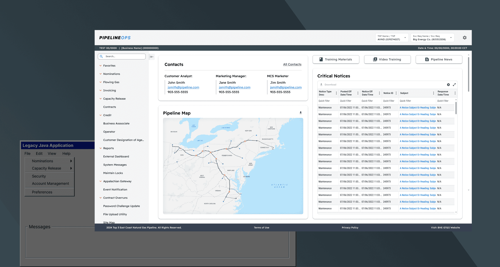
The client needed to modernize a 20+ year-old customer platform within the realities of a small budget, a lean team, and a legacy application that still needed to remain fully accessible. Because the original system and the 2.0 experience had to run side by side, this was not a clean-slate rebuild. The work had to respect backend constraints, support gradual onboarding, and preserve enough familiarity for long-time users while still moving the platform forward.
solution
The solution focused on creating a stronger application framework and a set of reusable patterns that could improve the experience without requiring a full rebuild. We established a more usable app shell, turned the homepage into a more functional dashboard, and standardized core patterns like data grids, stepped workflows, and error feedback so they could scale consistently across the platform. That approach helped simplify complex tasks, reduce inconsistency across features, and give the team a more practical way to modernize the experience while building a stronger foundation for future phases.
Establishing a familiar framework for a modernized platform
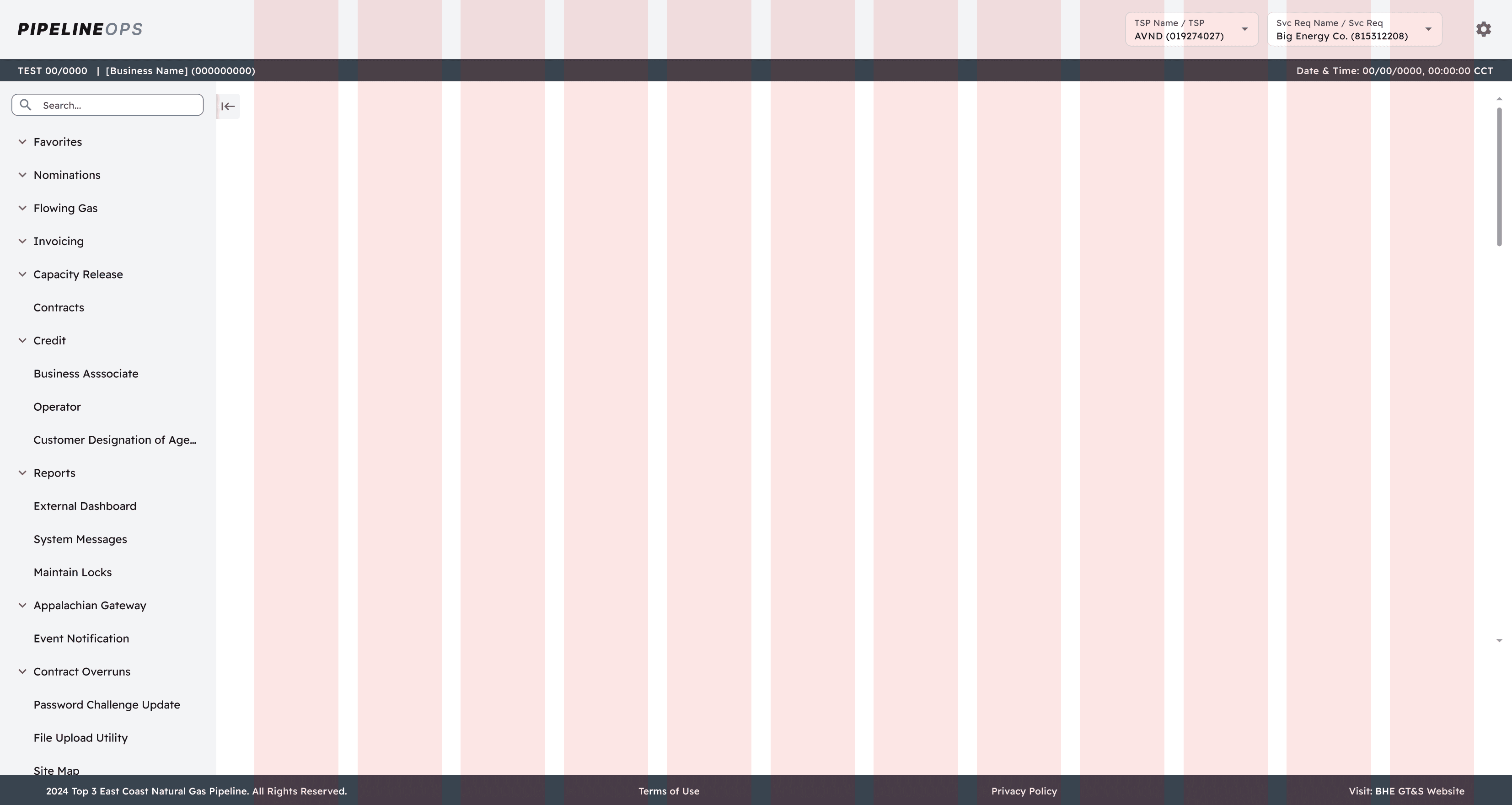
One of the earliest design decisions was defining the overall structure of the application. Because NAESB requirements dictated a left-navigation with a fairly rigid hierarchy, there was limited room to rethink the navigation model itself. Rather than forcing a completely new pattern, we focused on making the existing structure more usable while preserving the familiarity long-time users relied on.
Improving the navigation without disrupting legacy users
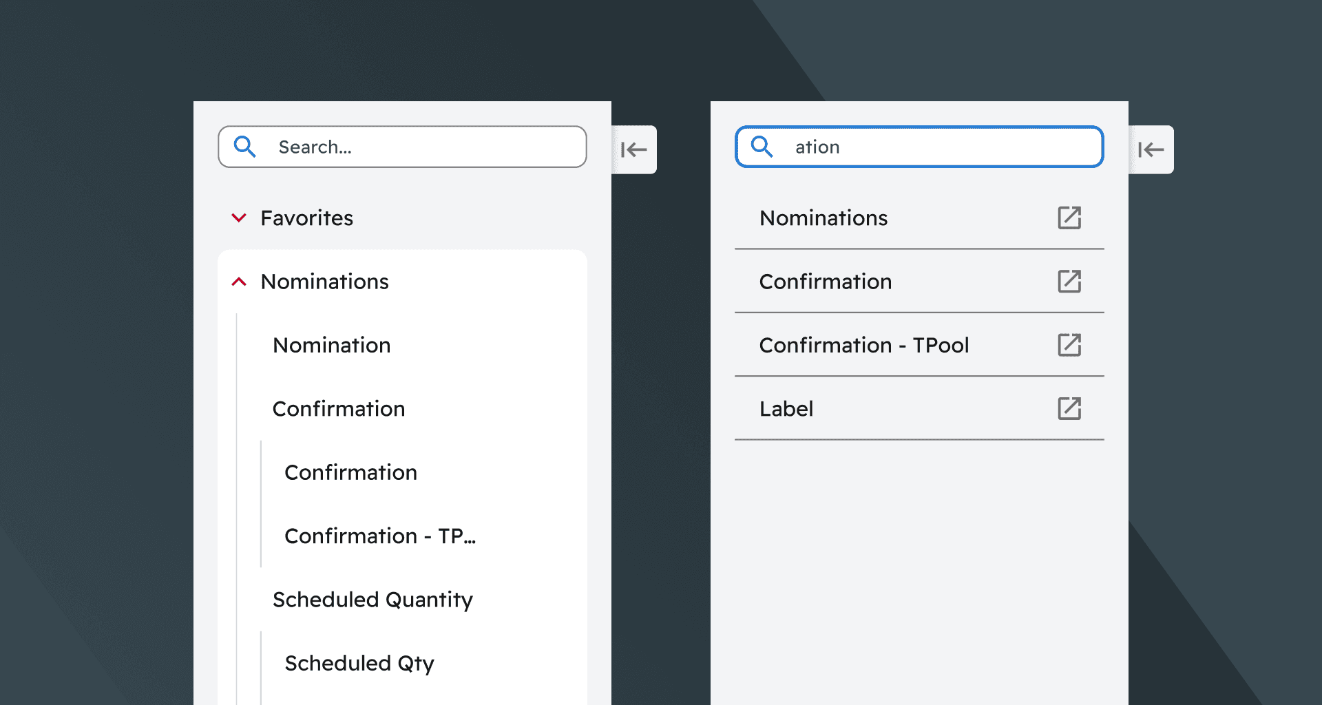
We explored several navigation concepts, including drill-down patterns that would replace the current menu with contextual submenus. While some of those approaches felt more modern, they tested as more disruptive for internal users who had spent years in the legacy application. We ultimately kept the accordion-based structure because it more closely matched what users already understood, then improved it with features like nav search and the ability to collapse the menu to reclaim space.
Reimagining the homepage as an operational dashboard
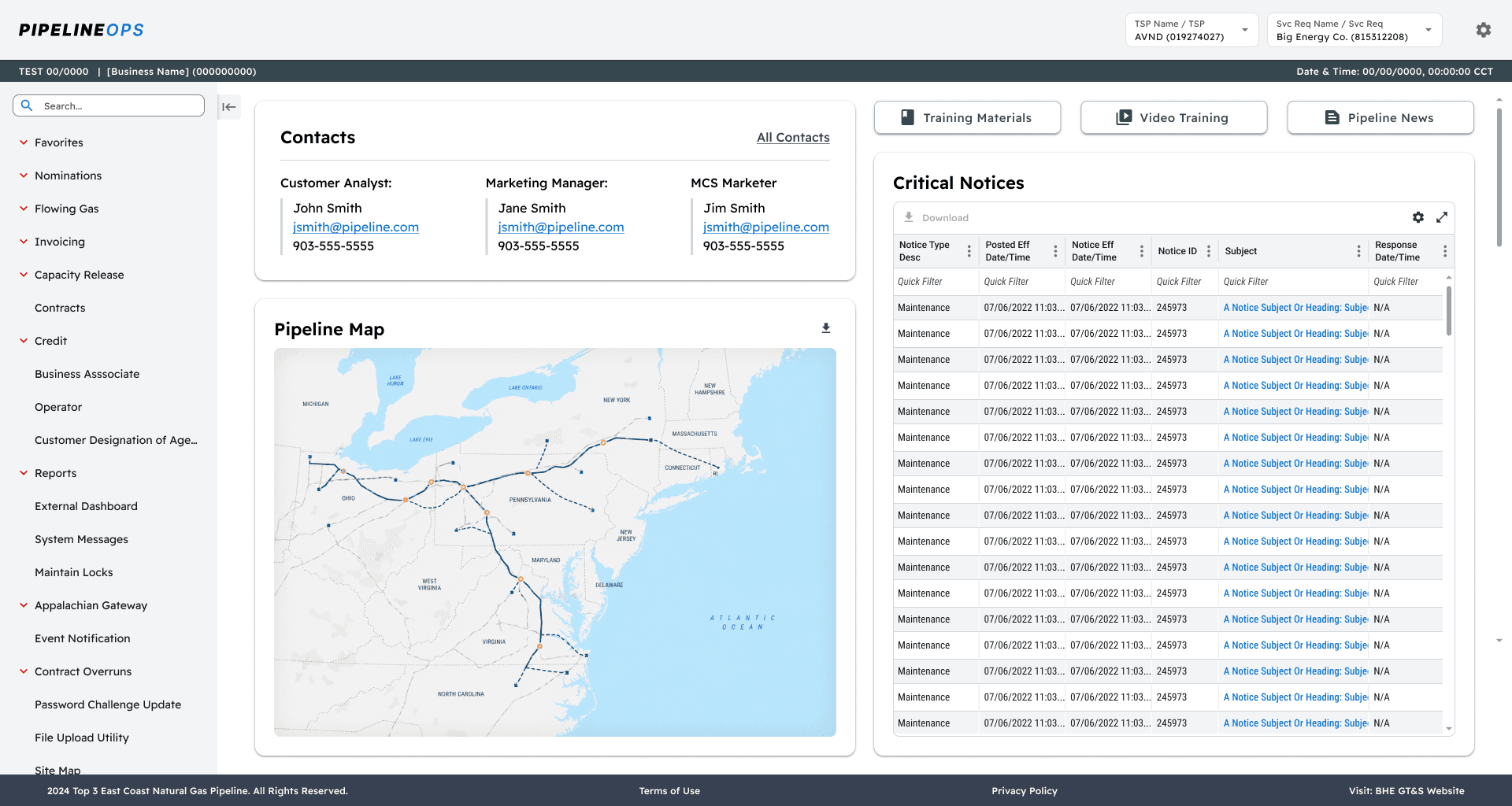
The homepage was the first full feature we designed. In the legacy system, that space was largely underused, but stakeholders saw an opportunity to make it more valuable by surfacing resources users needed regularly. The goal was to turn a mostly blank landing page into a functional dashboard that could support both quick access and future customization.
Standardizing the data grid as a core system pattern
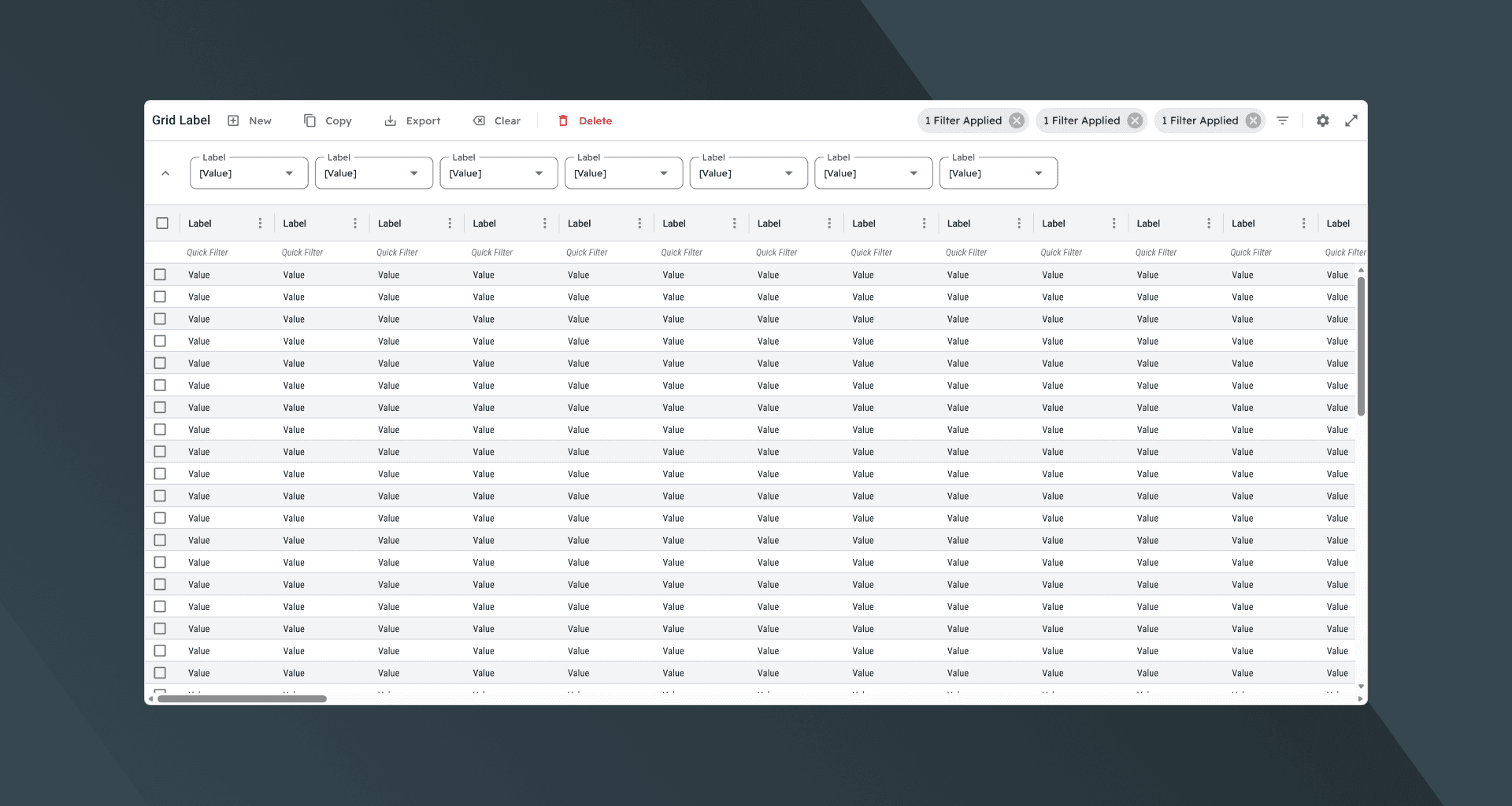
Many of the most heavily used customer-facing features relied on dense, editable datasets. Rather than rethinking that pattern entirely, we focused on making the data grid more consistent, usable, and scalable across the platform.
We standardized the interactions users depended on most, including sorting, resizing, filtering, saved layouts, density controls, and common data actions. Competitive analysis helped shape that richer feature set by showing where other pipeline applications were succeeding and where they were falling short. That early investment sped up production, reduced inconsistency, and created a stronger foundation for more advanced grid behaviors over time.
Standardizing stepped workflows for complex tasks
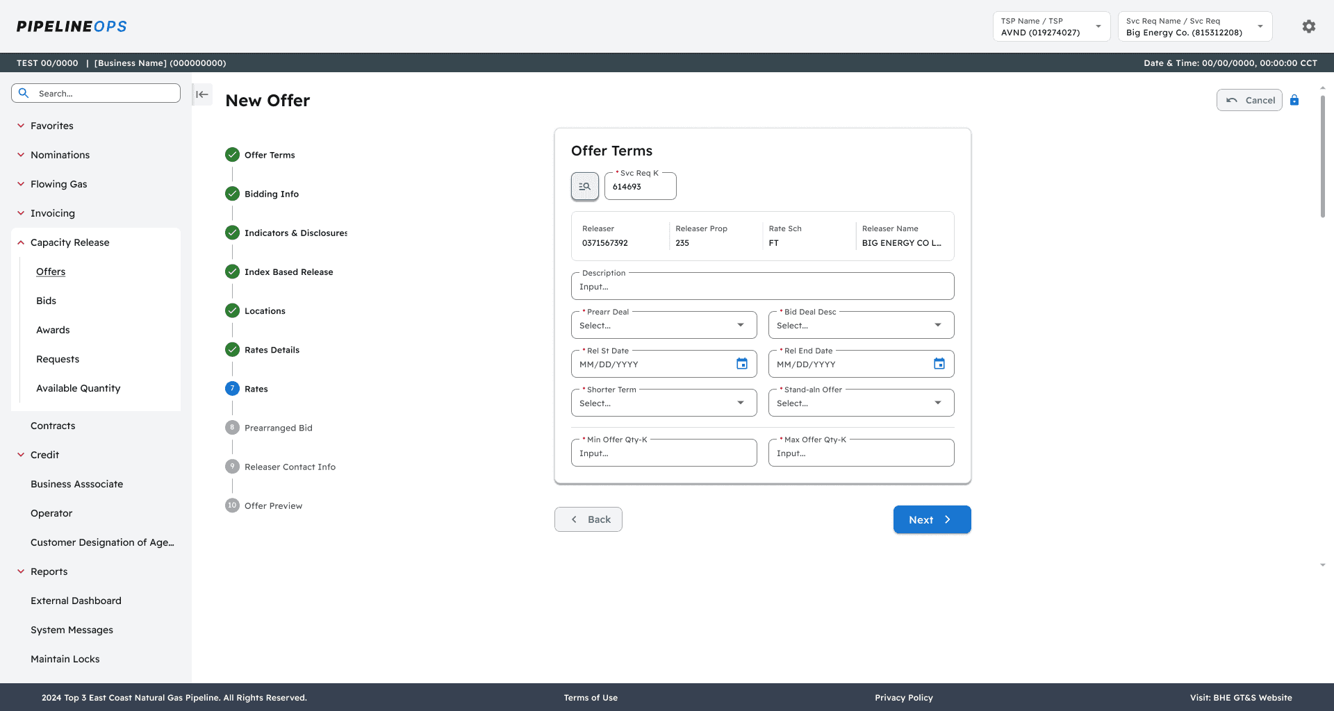
Many of the platform’s highest-value workflows were also some of its most complex. To make them easier to navigate, we broke them down into smaller mental models that better matched how users actually worked through the task.
That approach led to a reusable stepped form pattern that could flex across multiple features. It gave users clearer progression, reduced cognitive overload, and became another core interaction pattern within the system.
Designing clearer feedback for error states
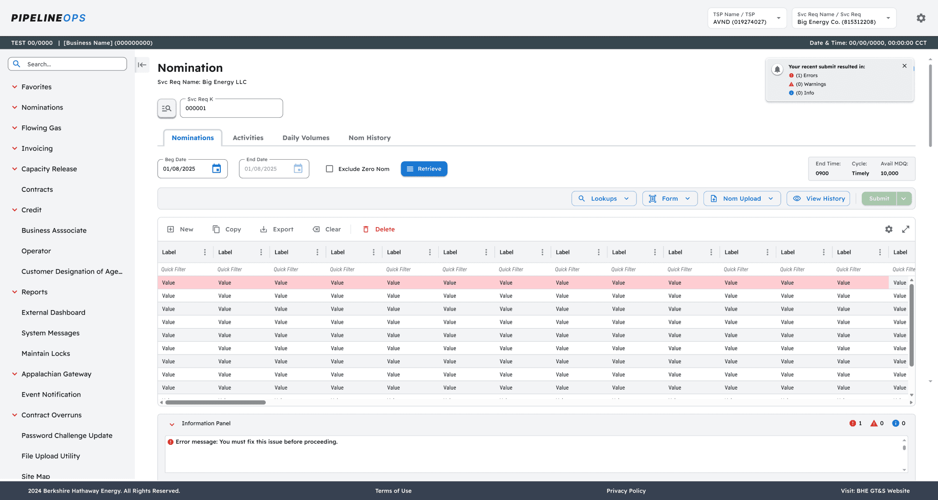
Providing useful feedback in editable data grids was another important challenge. Because the backend did not support tracking IDs at the cell level, we could not point users to individual error cells in a precise way.
Instead, we highlighted affected rows in red and surfaced the related issues within an Information Panel. That panel became another flexible, reusable component that helped users understand and resolve errors more clearly across a range of workflows.
Leading cross-functional alignment through delivery
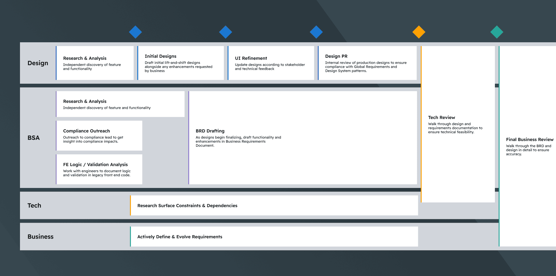
Because the platform was being modernized in phases, strong design work alone was not enough to keep the project moving. A big part of my role was creating the structure for design, BSAs, business stakeholders, and engineering to stay aligned as features moved from discovery through feasibility, iteration, and sign-off.
I helped establish a repeatable cross-functional process that included kickoff discovery, early design review, requirements drafting, stakeholder checkpoints, feasibility discussions, peer review, and final approvals. That structure gave the team a clearer way to evaluate trade-offs, keep decisions moving, and maintain alignment across parallel work streams as the platform grew.
year
2023-Present
timeframe
3+ years
tools
Figma, Copilot, Material UI
category
UI/UX