VA Tax
Making a high-friction public transaction feel clearer, more trustworthy, and easier to complete
00

problem
Virginia Tax’s guest payment flow was a key public-facing entry point, but moderated user testing revealed clear friction. The experience was not optimized for mobile, system feedback was unclear, and there were almost no front-end validations to help users recover from mistakes in context. Trust was also weak. Because the payment flow lived in a third-party environment and did not feel visually aligned with Virginia Tax, users had reason to question whether they were in the right place. The challenge was to improve both usability and confidence across the full path to payment.
solution
The solution focused on simplifying the payment flow, improving in-context feedback, and creating a more cohesive visual system that better matched the broader Virginia Tax experience. By restructuring the form, improving UX copy and validations, and making the experience more mobile-friendly, the redesign made the transaction clearer and easier to complete. I also pushed to improve the printed bill, even though it was outside the original scope, because it shaped user perception before they ever reached the portal. Redesigning that entry point alongside the digital flow helped create a more trustworthy end-to-end experience.
Starting with the current experience
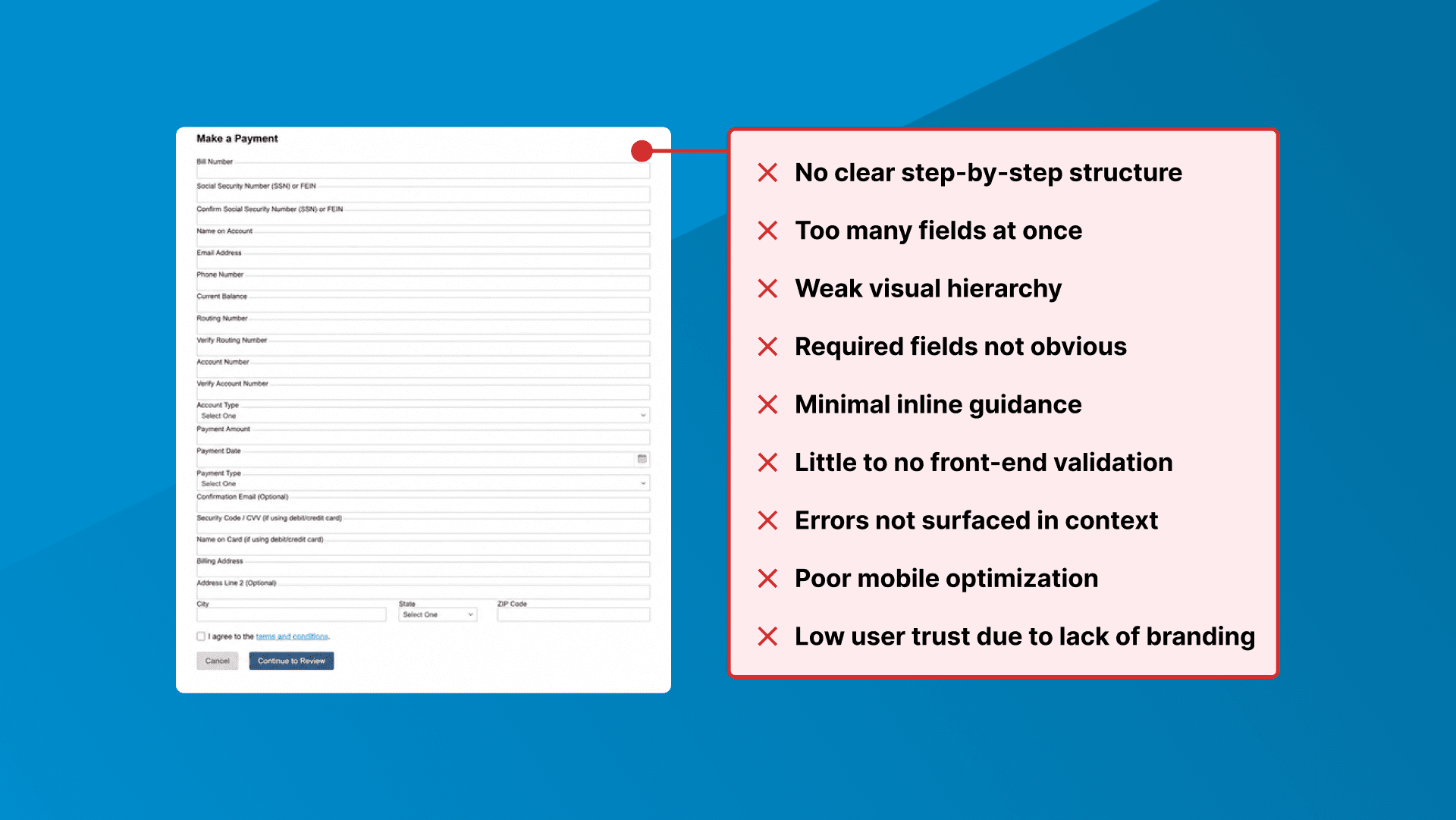
We began with usability testing to understand where users were struggling in the current guest payment flow. That research surfaced several consistent issues: the experience was not optimized for mobile, system feedback was difficult to interpret, front-end validations were minimal, and the dated third-party interface weakened user trust.
Those findings gave us a clear baseline and helped focus the redesign on the areas that were creating the most friction for users.
Simplifying the payment flow
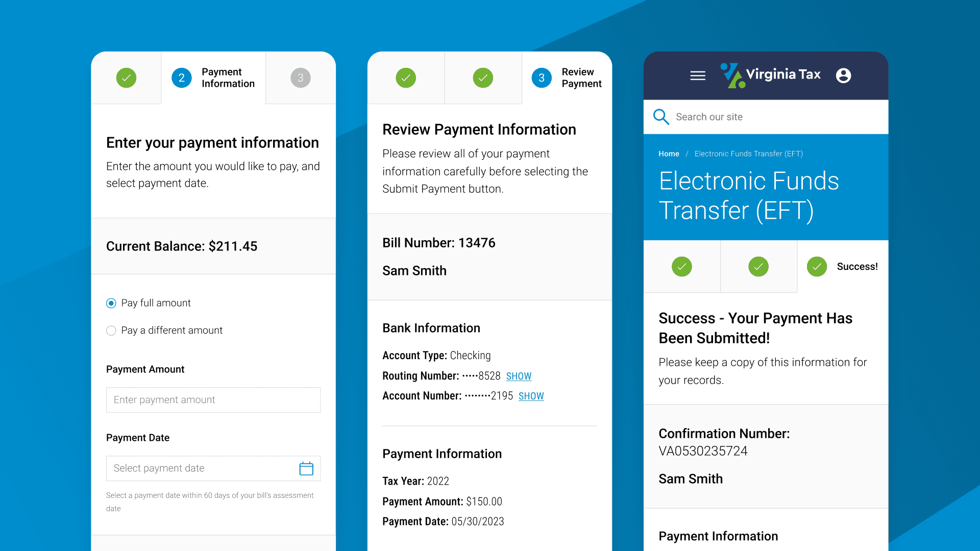
From there, the work focused on reducing cognitive load and making the payment flow easier to understand. We restructured the form, improved hierarchy, and clarified the sequence of information so users could move through the transaction with less hesitation.
After testing multiple directions through wireframes and aligning the flow with established best practices for payment forms, we secured stakeholder buy-in and moved into high-fidelity designs and prototypes.
Validating the final designs through testing
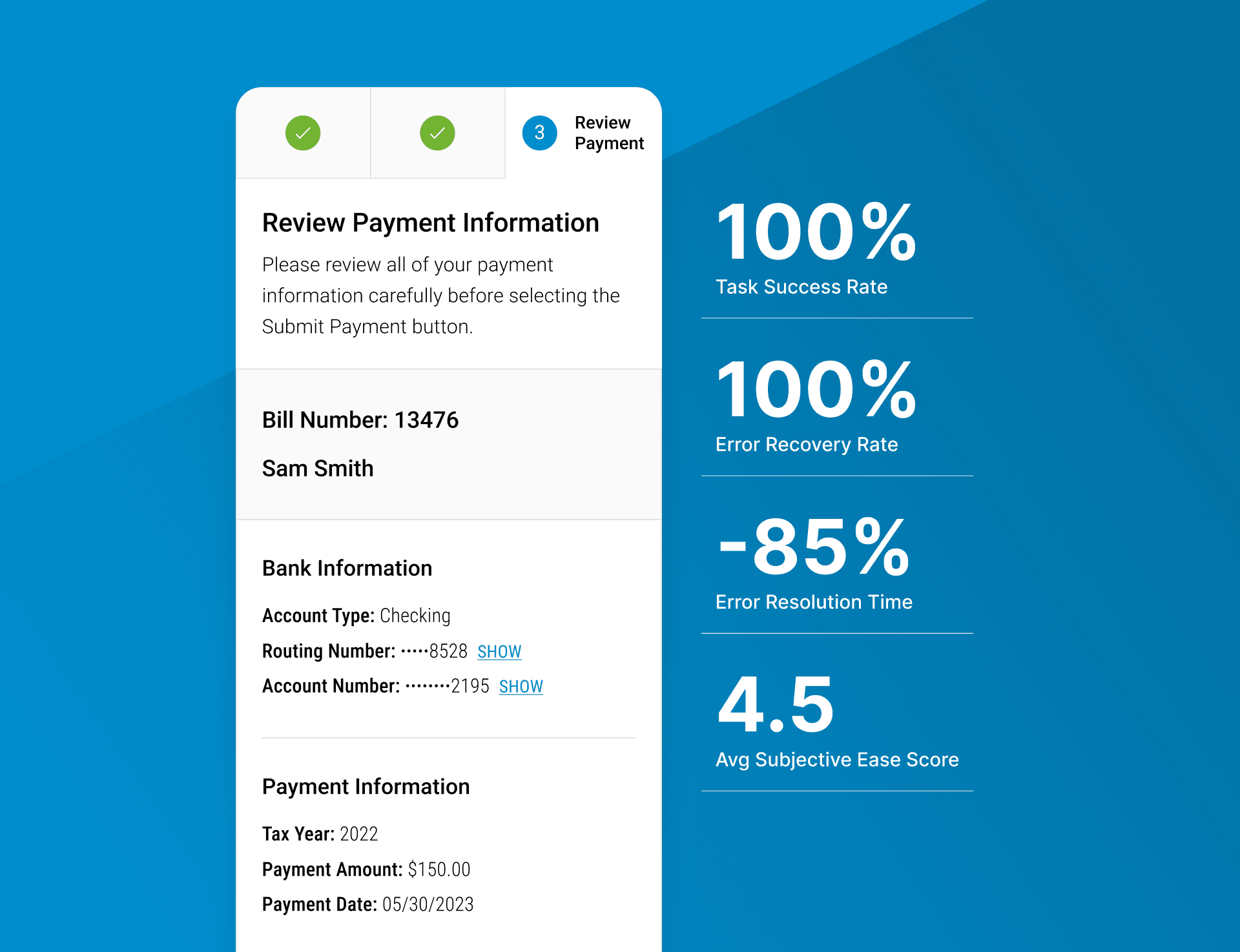
With high-fidelity designs and prototypes in place, we used usability testing to validate that the revised flow was clearer, easier to navigate, and better aligned with user expectations. The redesigned experience achieved a 100% task success rate, zero outright failures, and a 4.5/5 subjective ease score.
The testing also confirmed that front-end validations significantly improved error recovery. Users successfully resolved 100% of surfaced errors without moderator assistance, average error resolution time decreased by 85%, and failed submission attempts were eliminated entirely. Smaller findings around instructions, wording, and check-based guidance were then rolled back into the final designs.
Building a more practical system for handoff
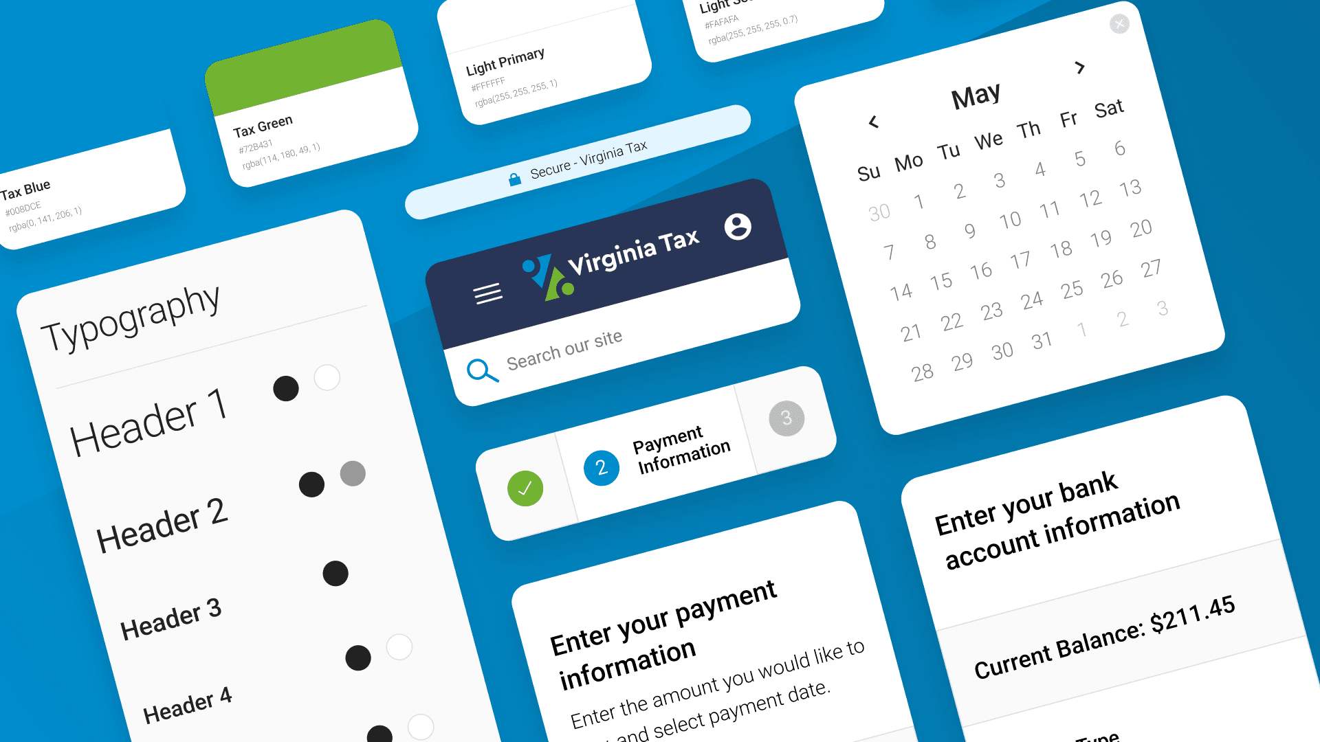
To support implementation, I adapted the existing Virginia Tax brand guidelines into a more practical design system for the payment experience. That included creating new components where needed and annotating designs so the client’s in-house engineering team had a clearer path from design to build.
This not only improved handoff quality, but also helped align the third-party portal more closely with the broader Virginia Tax experience, reinforcing trust through greater visual consistency.
Taking the solution beyond the form
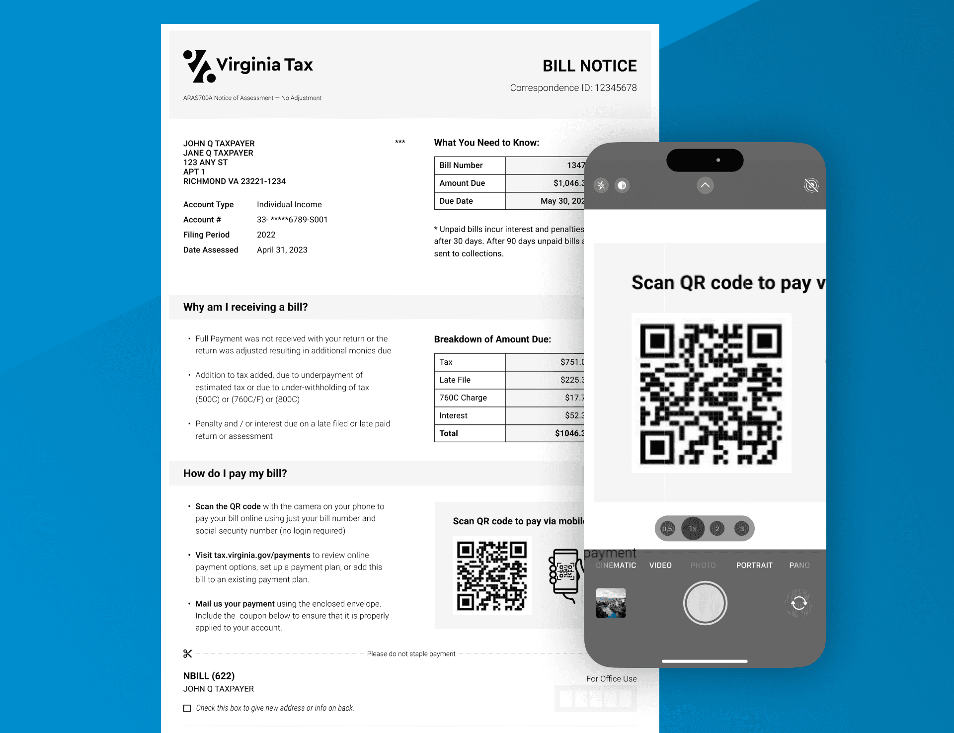
As the redesign progressed, it became clear that user confidence was being shaped before people ever reached the portal. The printed bill was not part of the original scope, but I pushed to redesign it anyway so key details like amount due, due date, and payment options were easier to scan, and QR code access created a more direct path into the payment flow.
That decision helped strengthen the experience at an earlier stage and made the overall path to payment feel more coherent and trustworthy.
year
2022
timeframe
3 Months
tools
Figma, UserTesting
category
UI/UX